
VScode, ChatGPT, Replit

Design/Develop A Solution

Phase 2 In Progress
Background
I previously subscribed to a budgeting app called Pocketsmith, which allowed me to forecast my bank balance based on my budgets/recurring transactions. However, I was not satisfied with the app’s experience. I replaced Pocketsmith with Monarch Money for its elevated experience and ease-of-use, which left me with the need for a forecasting solution. I decided to create my own forecasting app, but would improve upon the shortcomings of Pocketsmith’s experience.
Initial Discovery
Although I am the primary end-user, I wanted to be sure I developed a tool that would truly solve the problems I was facing. So, I began like any Product Designer should: Try to understand the true underlying problem…
Competitive Analysis
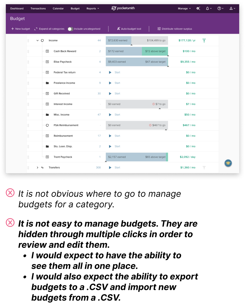
I began by taking screenshots of the main flows in Pocketsmith and noting the bugs, issues, and even the good experiences. I also explored other apps like Buxfer, Kualto, and CalendarBudget, which also fell short.
The image below notes one of the key problem areas I experienced while working with Pocketsmith.
Synthesized Insights
After collecting insights from multiple personal finance apps, I organized them into several groupings…

Problem Statement
The synthesized insights helped me develop a Problem Statement, which in turn helped me define the requirements needed for execution:
I am a fiscally responsible person trying to
make financial decisions that will positively impact my bank balance trajectory. However, the forecast software I use is difficult because there is not an intuitive way to easily and quickly manage my forecast budgets, scenarios or goals, which makes me feel frustrated and overwhelmed.
Solution Development
Based on my insights during the Discovery phase and the new Problem Statement, I determined the app should have the following requirements to answer the need for easy and quick budget management:

Primitive UI
I began by establishing a quick UI to work within for my initial proof-of-concept. I considered this first pass as a generic outline that would inform a more elegant experience once I learned more about how I wanted to integrate the solution into the experience.
Here was my approach using the primitive UI to achieve the initial requirements…
Add/Remove Budgets
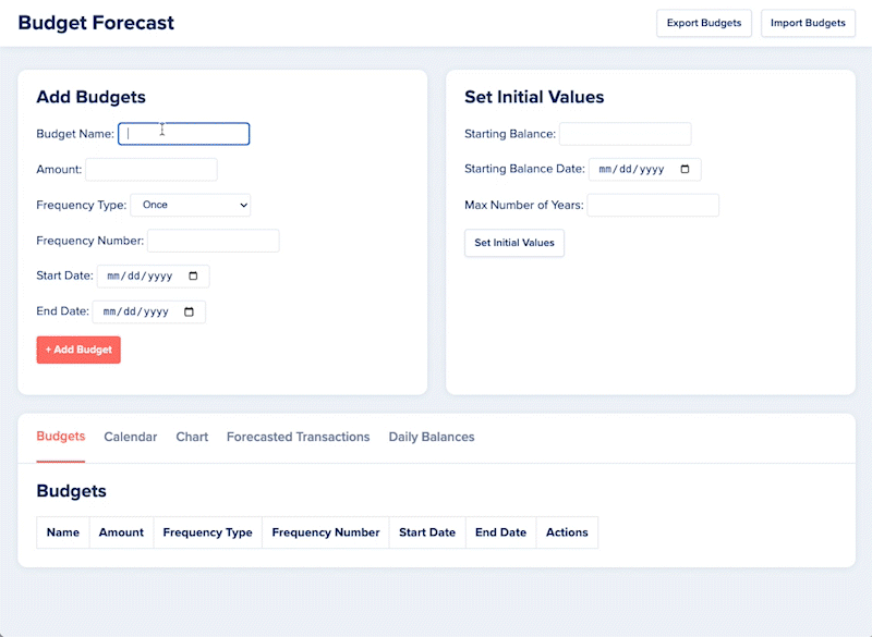
Import/Export Budgets
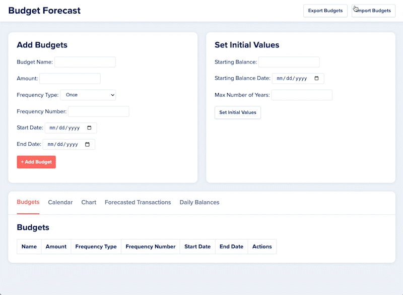
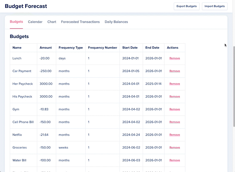
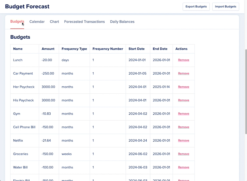
List View
Generate Forecast
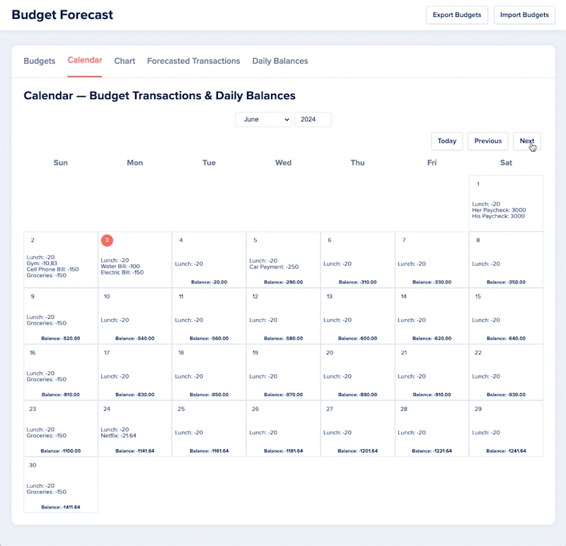
Forecast Calendar
Forecast Line Graph

Additional Discoveries
While developing the proof-of-concept, I discovered a few additional features that I could quickly implement that greatly improved the experience and my understanding of the forecast:
Trajectory Indicators
I wanted to visually display the beginning and end of budgets to better understand changes in trajectory. Green dots indicate a positive shift, where a recurring expense expires or income begins. Red dots indicate a negative shift, where a recurring expense begins or income expires.

Initial Values
I also wanted to establish a starting point for the forecast, so I implemented a form to input a starting balance and starting date.

Success
The initial approach to the app made a world of a difference in my budgeting flow. While I met all the requirements I started with, the experience also gave me greater confidence while managing my finances. With the ability to quickly see what budgets are in place and easily make modifications, I understood my budgets better and I no longer dreaded the task of making updates.
The following charts compare my forecasted and actual Cashflows and Balances. I was delighted to see how accurately they aligned with each other.


Enhancements
The initial approach to the solution further informed my understanding of the problem, which I used to curate a new set of requirements for phase 2:

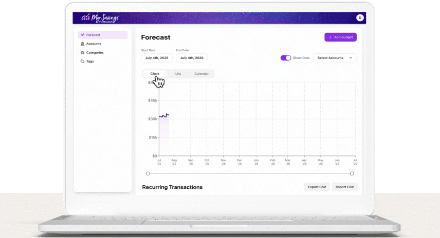
Phase 2: My Savings Forecast
For the second phase, I utilized an AI coding service called Replit. This change increased my ability to quickly implement the enhancements mentioned above, test different solutions, create accounts, and debug. I also decided to create a domain for the app: My Savings Forecast.

Next Steps
Optimize UI

Optimize UX
Here are a few of the features I plan to implement to improve the experience…
Scenarios
To visualize how hypothetical budget changes will compare against your current budget/forecast.
Goals
Auto allocation of savings toward specific goals to forecast when that goal can be achieved.
Balance-Based Transactions
To account for credit card balance payments, savings account interest and other transactions that occur based on an account’s balance.
Bulk Updates
The ability to select multiple transactions and make the same updates to all of them at the same time.
Filter Transactions
The ability quickly find transactions based on specific criteria.
Try the App!
If you’re interested in trying the app in its current version, visit app.mysavingsforcast.com.
Monarch Money
While doing competitive analysis, I discovered Monarch Money and switched from Pocketsmith. Its fast, intuitive, and elegant design made budgeting more enjoyable. Features like projected balances and a flow that fits my needs helped clarify UX gaps I’d seen elsewhere.
I plan to base the next phase of design on Monarch’s visual language to ensure a seamless experience between apps—minimizing cognitive load and benefiting from their strong usability principles.
Here is an initial concept that helps give direction I would like to take the UI design in the future.